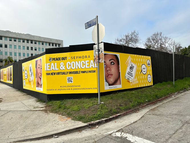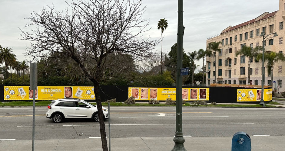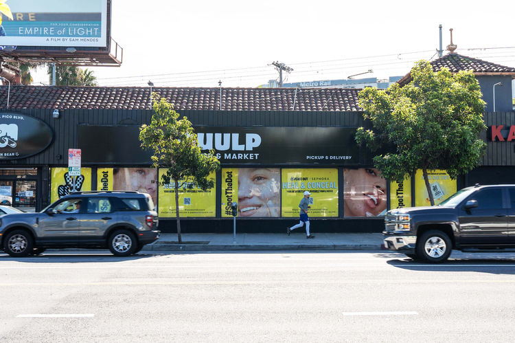
Building on a year of success, Peace Out launched the innovative Acne Day Dot. As the world began to return to normalcy in January 2022, the brand seized the opportunity to connect with people out and about, giving me to opportunity to lead a vast out-of-home creative campaign.
.jpg)
The goal was to create something bright, fun and eye catching. We chose yellow as the primary color associated with the day dot in order to invoke brightness and positivity while being eye catching and visually synonymous with happiness.
As a brand focused on simple, fun & effective skincare, it was important to have clear messaging, a fun visual, and clarity about the product. For this, it was showing real skin & how effectively these pimple patches become virtually invisible when paired with makeup.
One of the most challenging aspects of this project initially was the extensive concepting required. For elements like our subway take over, we had to design for unique structures and display areas, which demanded 3D experiential thinking.
This opportunity allowed me to further develop my skills in spatial design while also testing my technical abilities, as I had to create cohesive, large-scale graphics for various spaces.
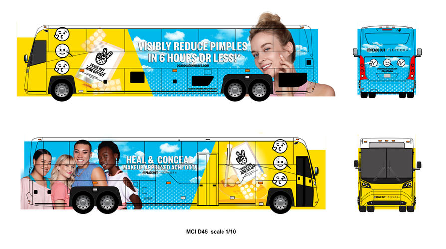
Vinyl wrapping two buses was another exciting design challenge I enjoyed. With their unique structure and specific dimensions, accuracy became crucial. Since there was no way to test the designs before printing and application, clear communication with the vendor was essential as we worked toward the final design.
Much like our billboards, the end result for the buses featured fun, eye-catching visuals that communicated the product's efficacy while staying true to the brand and the campaign's mission.


